Improving Plant Monitoring System
The primary goal of designing the Plant Monitoring Dashboard was to simplify real-time sensor data analysis in oil and gas plants, enabling informed decision-making and improving operational efficiency.
Note: This case study is more than just screens — it’s a deep-dive into the UX process. From research and problem framing to mapping user flows, wireframing, and applying UX laws like Hick’s, Miller’s, and Fitts’s, every step was grounded in design rationale.
The goal here is not only to present a solution, but to show the thinking behind the design — how user behavior, usability principles were balanced to create a system that is both effective and intuitive.
So, take your time, read with patience, and enjoy the journey of how research, UX strategy, and design laws shaped this project into a real problem-solving experience.
What did I do?
Strategy
Wireframing
UX Research
UX Design
High-Fidelity Prototyping
Team collaboration
Problem
Statement
The oil & gas industry relies heavily on real-time monitoring, but existing plant monitoring solutions are often cluttered, complex, and not user-friendly. Client in the oil and gas industry needs a custom dashboard that simplifies real-time sensor data. The dashboard should enable users to compare and analyze ongoing processes and gain insights from historical trends.
The dashboard should support the following five sensor data types:
• Temperature
• Oil Flow Rate
• Pressure
• Tank Level
• Choke Open Percentage
Requirements:
• Real-Time Data Comparison: Users can select and compare data from several sensors.
• Insights & Analytics: Provide analytical insights based on the data trends
• Visualization: Offer graphs and tabular format for users to compare data points better.

Insights
Solutions in Oil and Gas Industry are majorly limited because it’s a complex industry, and a gap between designers and users. Each plant is different at some level ,that’s why scalability of solution and integration of different sensors in one system is concern.

Understanding How PI System Works?
PI system collect data from different sensors, then store for historical trends analysis, manage it for example notify user about an alert etc., and present it in a format understandable to user for analysis or for integration with other cloud or IOT service or to train a ML model

The oil and gas industry is broken down into three segments:
Why current design fails?
Found some similar solutions, but they are lacking in visual design and fundamentals of UX. The design is not user-centric & intuitive. I didn’t got chance to use this software but from webinars, demo videos and catalogues they gave me a good idea about their working and problem they address etc.


7 billion USD
Current Market Value
9 billion USD
Market value by 2031 (as expected)
3.68%
Growth Rate


Design Solution
Users: From plant managers to workers, all will use this program. Complexity is tried to make as low as a person who doesn’t use digital experience much must also understand what is what, and what it does.
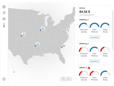
• Home-screen, which displays key plant locations, their performance metrics, and quick CTAs.
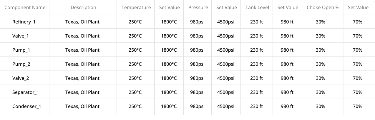
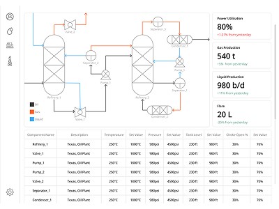
• Next is a Plant Overview Screen which shows information of refineries in a diagram & tabular view for more clarity
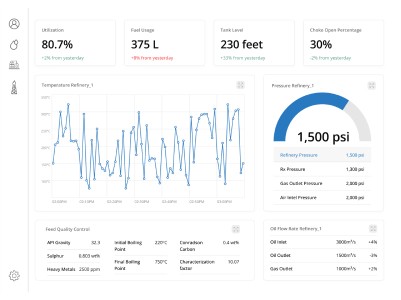
• Then comes the Main Dashboard screen, I divided the screen into graphical & tabular view making it more intuitive.
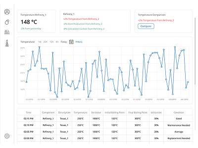
• Detailed Sensor View: Historical trends, filters, and comparison across multiple sensors.
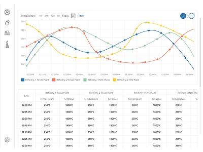
• Comparison Screen: Graph + table combination for cross-plant or cross-component analysis.
All Plant
• Oil Price
• All Plant Location
• All Plant key metrics
• Select Plant
Dashboard
• Main screen
• 5 Screens
• comparison options
• Select sensors
Plant Overview
• Plant key metrics
• All components
• Select component
Sensor Data
• Specific sensor
insights
• table + graph
• compare graph
Comparison
• Compare ‘N’ sensors
• table + graph
• options
User Flow
Before diving into the final design, I first mapped out the user flow to understand how a typical user would navigate the system and interact with different levels of information. The idea was to ensure clarity, reduce cognitive load, and apply progressive disclosure so that users see high-level insights first and can drill down into details only when needed.